Passenger Car Finished

My passenger car is finished and packed ready to go down to Sacramento to show in the NMRA national show next week. To support my display in Sacramento (and likely in Burnaby this fall, and who knows where else), I threw together a quick 20-page Blurb book on the project. It is laid out like an NMRA merit judging form, and I’ve pasted the bulk of the content below:

Introduction

Surely I could have chosen something simpler for a first passenger car project. Surely I could have found a car where we have actual drawings if not clear photographs. Surely nobody would mind, even, if I bought a kit for a passenger car, lettered it for the Canada Atlantic, and challenged anyone to call me a liar.
I would mind.
The prototype modeling path is a personal choice, and we all must decide how far down the path we will go. For myself, there are so few resources showing the Canada Atlantic as it really existed, that I feel I must replicate ever one of them as closely as I can.
My current modeling project is the town of Pembroke, Ontario, and we have four photographs of the same passenger car on the line. This, then, is the car I need. Substituting another car would be akin to ignoring one of my sources in prototype modeling, and ultimately diminish the total effect.
So, without drawings, photographs, incontrovertible dimensions, without even a car number, I set off to replicate the car and the train, pulling into Pembroke sometime around 1905.

Prototype

My model of Canada Atlantic #2 is based entirely on four photographs that show a combine on the Pembroke Southern. From the photos, it is impossible to discern the number; however an undated roster from the Grand Trunk Railway shows two 1st/2nd/baggage cars that were inherited from the CA — numbers 2 and 4. Assuming our Pembroke Southern car was leased from the CA, which was the operating railroad, and assuming it survived until the GTR roster was compiled, the PS car was either CA 2 or 4. We have a clear photo of CA 4, and it does not match the PS car. So, if all our conjectures are true, then the PS car was CA 2.
Having said that, by the time of the roster, the GTR car was clearly different from the PS car. Notably, on the GTR car, the windows were double, not single. This seems a major structural difference, but all the other dimensions match. It is possible that the car was modified by the GTR or that the roster was incorrect. In any case, this model represents the Pembroke Southern car, which was certainly leased as the PS had no passenger equipment of their own, and the CA seems a likely lessor, and CA #2 is a likely identity.
The length of the PS car was drawn from the photo of the train at Golden Lake and the known length of the bridge spans at Golden Lake. Dimensions such as height and width were standard on the CA to within three inches, and so, I used those standard dimensions where they were applicable.
Where I had no data for the PS car or for the CA, I resorted to industry information. The CA built many of their own coaches, but they also bought cars from Crossen in their earlier years, and Pullman later on. We are fortunate that Ted Rafuse has written an excellent book on the Crossen Car Company, and this served to furnish some typical details.
Further information on typical car construction was gleaned from the Voss book on Railway Car Construction, especially the chapter on a NYC&HRR day coach. The cross-section of the clerestory was especially helpful in getting the roof correct, as was the body bolster drawing. Many other details were pulled from the White’s book on passenger cars and from a visual dictionary for car builders.
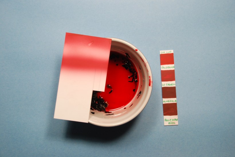
Finally the question of colour took months to resolve. Obviously, we have no colour photographs of CA rolling stock. There is one colorized post card that may show some of passenger cars, although the cars are on the Canadian Pacific’s track, and so they are just as likely the CP’s. We also have a newspaper account suggesting that CA passenger trains were “Turkish Rouge.” This note lead me on a lengthy mission that ultimately culminated in replicating an antique cosmetics recipe using the original ingredients; the key ingredient is Alkanet, and it has a beautiful pinky-red colour under some light. I’ve never seen a colour change so dramatically from one light source to the next, however, and the colour of the model depends heavily on the light under which it is viewed.

Construction

Roof and Body

The hard part of passenger car modeling is the roof, specifically the end where it is all compound curves, and not a straight line in sight. As I pondered how to create these ends, I became aware that 3D printing was becoming increasingly capable and within reach. So, I resolved to print the roof.
A common failing of passenger cars, especially those with separate roofs is that the ends of the letterboard are very fragile and never properly engage with the ends of the roof. Printing the letterboards along with the roof meant that the colour separation would have to be masked, but the parts would mate perfectly. Once the decision to mask the letterboards was sealed, it seemed obvious that I may as well print the whole body.
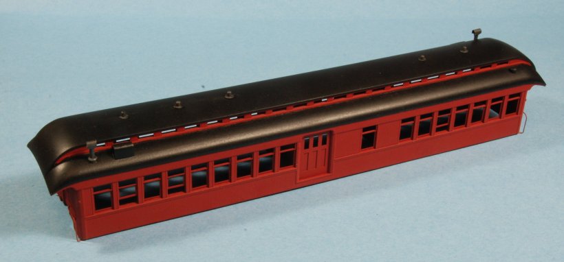
So that is what I did. Working from dimensions pulled from photographs and prototype practice, I developed a 3D computer model of the body and roof. The resulting model contains some 31 thousand vertices, and includes details such as door handles and flag holders. This model was then exported and printed using stereolithography. The stereolithograph required cleaning and sanding to remove evidence of the production process, especially on the roof.
Sadly, the stereolithography process does not facilitate very thin sections, and so, the window sashes could not be printed. However, because I had a computer model, it was a simple matter to create a pattern for a laser cutter, and cut these out by machine. The grooves where the real sashes ride were included in the model, and the laser-cut sashes ride in these grooves as per the prototype (they are fixed in place, however).
For a while I thought I would leave one of the baggage compartment doors open on the model, and to support the thin cross-section, I laser cut these at the same time as the window sashes. As long as I was laser cutting, I also cut all the glazing as well.
The roof was dressed with a number of scratchbuilt detail parts such as the baker heater expansion tanks and stacks, the lamp jacks and the toilet vents. I created these separately rather than integrally with the model either to facilitate colour separations or so that they wouldn’t get in the way of finishing the roof.
The only details left off the body in the computer model were the handrails. The flattened ends of these were included, but the handrails themselves were too fine to print, and so, they were built up in brass.

Underframe and Platforms

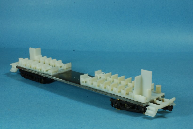
The core of the underframe is a 1/8” thick piece of steel, cut to fit precisely into the body. This provides almost the correct amount of weight as well as super-strength to what could be a troublesome floppy piece of modeling if done in wood or styrene.
The steel underframe is covered with a wooden sound-deadening ceiling that I built board-by-board. The needle beams and body bolsters were incorporated into the ceiling as, being frame members, the ceiling would have been built around them.
The platforms, steps and end beams were stereolithographed together with the interior, ensuring that they are straight. They are somewhat vulnerable out there, however, and so, my next car will incorporate more of the steel in the platforms.
Various details, such as the brakes, levers, train line and so on were glued straight to the sound deadening ceiling or between the frame members under the platforms. These details are all made from commercial parts or fabricated from plastic, brass or steel, as appropriate.

Interior

The interiors for the two passenger sections were also stereolithographed, complete with seats, toilets, sinks, baker heaters and partitions. Even the door handles on the interior doors were printed. The figures are from Preiser.

Finish

I airbrushed the body, roof and interior. Because the colour reference – a reporter’s impression of the colour – is so imprecise, I used Polly Scale Pacemaker Red straight from the bottle after comparing all my reds with my Turkish rouge sample.
The lettering was drawn in Corel Draw, working from some distant shots of CA coaches along with a crisper Grand Trunk car that seemed to exhibit similar lettering. From this lettering, I produced dry transfers, and installed on the letterboards and on the sides.
The lining was a nightmare. At first, I thought I would use a paint pen from Sharpie. While my initial tests on scraps went fine, I couldn’t manage a consistently fine line on the model. I wound up stripping the side and taking a mulligan. The successful technique employs coloured pencil, and is convincingly understated. When you see photos of CA cars in the nineties and early 20th Century, the lining is barely there.
The interior was brush-painted with acrylics, as were the passengers.
The underframe is mostly wood, stained before installation. To obtain clean colour separations, the brakes and other parts were painted before installation.
The underframe along with the roof received the bulk of the weathering. On the underframe, this consists largely of dry-brushing and an overspray with the airbrush. On the roof, I used chalks and weathering powders.

Clerestory Lights Installed

I’m not overly excited about them, except to say that they’re finally done, per the plan.

The windows in the clerestory are framed deeply for some reason, and the openings were screened over. The only screen material I ever saw that was convincing was some that my friend Brian Pate salvaged from an old anti-glare screen for a computer. And, I don’t know how I would have cut so many little rectangles of that stuff. Perhaps I could have etched them, but I doubt I could have got them fine enough to be convincing.

In the end, I printed some clear blocks that are shaped to fit in the holes, and scratched the suggestion of a screen on the fronts of the blocks. It’s not bad, but it’s not good either. Maybe on the next car I do, I’ll come up with a better alternative. Here are the blocks before installation

You’ll also notice that I’ve fixed the lining. The new lining is done with a coloured pencil. It reminds me of the tale of the first space pen that Nasa spent countless dollars developing; the Russians sent their cosmonauts up with pencils. Anyway, the pencil is very easy to control, and makes about as fine a line as I could want. I was even able to reproduce a little filigree in the corners.

Doh!

Well, the lettering turned out quite nicely, but who let me near this model with that awful Sharpie gold paint pen? The practice runs looked good, but when I went to line the model itself, there was no way I could get anything nearly fine enough. The air turned blue as I tried to salvage it, but the more I did the worse it got. It’s definitely a repaint.

End railings etc

Here also are the end details. The railings are made by sandwiching the uprights between the top rail, and squeezing it all together. Then I filled them in with solder and filed to shape to make a railing that was round where it was vertical and flat where it was horizontal. The chains are an etching from Athabasca Scale models. I’ve always felt that the real chains are too heavy for most HO applications. Certainly on end railings, they are too coarse. These neat etchings solve the problem elegantly.

Lettering Arrived

For some reason, it’s always exciting to see the lettering for a model. Now I know I’m in the home stretch, and I can’t wait to see it on.

For all my Canada Altantic models thus far, I’ve asked All-Out Graphics to create custom dry transfers for me. It’s a bit pricey on a per-sheet basis, and so, I always squeeze as many cars as I can out of a single sheet. So, while a single sheet including negative came out to $55 for gold, I fit four passenger cars worth of sets on that sheet, which brings it down to 11 per car, and that’s not that bad considering it’s custom.

I like dry transfers because there’s no messing with decal film. Loads of people complain that they don’t like the one-shot deal, but I’ve never found that to be a problem. To apply the transfers, I always lay them out and tape them down first. Once they’re taped in place, and I’m happy with the positioning, I rub them down for good. I find it’s important to cut them straight to avoid any optical illusions.

Sure, in my youth I had to pull some up (they come off easily with tape as long as you don’t burnish them down with the backing paper), but mostly I find this method of applying dry transfers works for me. There, now I’ve probably jinxed it.

I’ll post once the car is lettered.

Passenger Car

So here is the Turkish Rouge passenger car. Of course, the colour is impossible to get right, and with pretty much every monitor I see it on it is a different colour. It also shifts substantially depending on the artificial light. Overall, it was all a bit silly to go to such lengths to obtain the right colour based on a newspaper account. But here we are, the standard colour for my Canada Atlantic passenger coaches is now going to be NYC Pacemaker Red from Polly Scale.

I’m quite pleased with the way it has turned out thus far. Not much more to complete, except the lettering, of course!

The Search for Turkish Rouge

No sooner had I declared that the cosmetics industry couldn’t be counted on for historical accuracy, than I thought to myself that while that might be true of the industry itself, there are probably people out there who are interested in the historical accuracy of their cosmetics. After all, there is a slew of historical movies made every year, and I’m sure those makeup artists take their work very seriously. So, I set out to find such people.

It didn’t take long to come across the very friendly and helpful people on the EarlyPerfume Yahoo group. They not only knew what Turkish Rouge is, but how to make it (three different recipes!) and one of them even sold me a small packet of the key ingredient, Alkanet. Now, alkanet is the root of a plant, commonly known as Dyer’s Bugloss, and I’m pretty sure it hasn’t changed its root colour too much in the past 100 or so years.

So, all I had to do was to make some Turkish Rouge and then try to match it in paint. At the start, the root gave a very pretty pink colour, which I refuse to apply to any model I ever build. However, after a day, it’s now getting quite intensely red. By varying the depth of the container, I can get colours from the jolly pinky red shown here to a deep carmine and ultimately black.

There was an alarming shift from the orange side of red toward cerise when I brought it out of the halogen lights in the kitchen and into the daylight fluorescent down here in the train room. I see it has shifted again with the camera and my monitor. Meanwhile, the paint chips didn’t move nearly as much.

Oh what to do? And all this is because some reporter back in the late 19th Century chose “turkish rouge” to describe a new engine colour. We all know how reliable those chaps were. What if he was colour blind?

Passenger Car Colour

When I started researching the Canada Atlantic, and thinking I might one day model it, one of the supposed benefits was that a railroad that disappeared 85 years ago (this was about 1990) offered both freelancing and prototype modeling opportunities. Sadly, it turns out that I suck at freelancing.

I think it started with a corner of the mouth comment from Pete North, now of Kelowna or is it Penticton, when as a teenager I was assembling a couple of old Ulrich zamac semi trailers for my friend Tom Hood. When it came to a question of colour, he said something like I should really find a picture of a real truck of this type and copy it. Well that was pretty much the end of freelancing for me. I did paint those trucks whatever colour Tom wanted, but I was scarred for life.

Twenty years later, I am a committed prototype modeler, and an unapologetic rivet-counter (where did that term go anyway?). But now, the fact that there is so much unknown about the Canada Atlantic is not freedom, but a paralysis. Sometimes I go ahead and build something in the face of undiscovered information, only to have a picture crop up later to confirm or deny my suppositions. The best example of this is the original Pembroke layout, which was partially built in 1997 with the river much too high; a photo emerged just as I was starting to lay track proving I was wrong, and the layout has remained uncompleted ever since. The plan is to start over this year.

Sometimes, we period modelers just have to go with the best information we have. Take this passenger car I’ve been building, for example. Assuming that it is in fact a CA car (there is reason to doubt, but that’s another story), we know very little about its actual colour. There are two sources that I’m aware of — a reference to a locomotive (414) that was painted “Turkish Rouge” (Turkish Red!, Turkish Red!, Turkish Red 😮) to match its train, and this just in time photograph that I came across last year.

True there were no colour photographs in 1896-1900, and this is consequently a colorist’s interpretation of the black and white photograph, but this is the best information I’ve got. I’m definitely not going with any of those commercial makeup colours – that industry definitely can’t be trusted for historical accuracy, but these cars are in a nice railroady reddy wine colour, and so, that’s what I’m searching for. No, I haven’t found it yet. Today’s favorite swatch is a bit of Pacemaker Red, but it’s not purple enough. So, the search continues.

Incidentally, I’ve loosened up the comments section. You no longer have to log in to post a comment, but I have to moderate them. Maybe now I’ll have fewer requests to become users with really rude names; probably I’ll have to view some really questionable posts, however.

Well that was curious

I have spent literally days on trying to figure out why one end of the passenger car was so high. The bolsters were the same height relative to the floor and the platforms were not .5 mm different from the floor, but somehow the car was sitting with one end a half millimeter higher than the other. Finally, I switched trucks end for end, and the difference went away.

A few more minutes of puzzling revealed the culprit: the hole in one of the trucks was too tight. So, when I backed it out to allow a little equalization, it was actually lifting the whole car! A few twists of a broach and all was perfect. Still, a strange puzzle.

Strong bones

The interior came from Shapeways some months ago, but I seem to be making glacial progress this year. I suppose that means that I’m melting slowly, and occasionally a big lump will drop off, which is pretty close to the way things are going.

Anyway, as you can see, the interior came with the end platforms. These are actually a little more delicate than I’d like, and I’ve had to repair at least one stringer on each end due to rough handling after epoxying them to the frame.

Roof Details

Despite how it might seem if you follow this blog, there is still modeling going on in my basement. Here are all the bits that belong on the roof. Everything is scratchbuilt because, well, I’d rather spend my time doing that than pouring through catalogues looking for parts that probably won’t fit properly anyway.

The five lamp jacks were created with pins soldered into tubes, and pieces of sheet soldered to the outside of the tube, then turned down to size in my drill. A similar process made the toilet vents (I considered using a nail, but I couldn’t find two that matched).

The Baker heater stacks are made from a piece of 1/8″ rod turned in the drill for the base, then soldered to the stack itself, with the cap bent from sheet and soldered on. It’s interesting to note that the Baker heater stacks are oriented with their hoods lengthwise to the train on my car, while I would have installed them cross-wise so air doesn’t blow down the flue and into the car.

Everything except the Baker heater expansion tanks comes off for painting so I can get some nice crisp colour separations between what will likely be subtly different shades of black.

pesky baker heater

I’m still not sure I’ve got the right shape for the Baker heater expansion tanks. They started out as Scupley shaped on the model, baked and sanded off the model, and then glued in place and further sanded. Then I looked at some other tanks and decided I needed to make it squarer, and so I corrected the shape with Squadron White putty. Then I went back and looked at the photos of my car, and I don’t think it should be quite so big. Sigh. I don’t think I’ll correct it.

The top up funnel and cock is a little jewel: three pieces of brass that could just about fit on the head of a pin. They turned out nicely, even if I say so myself.